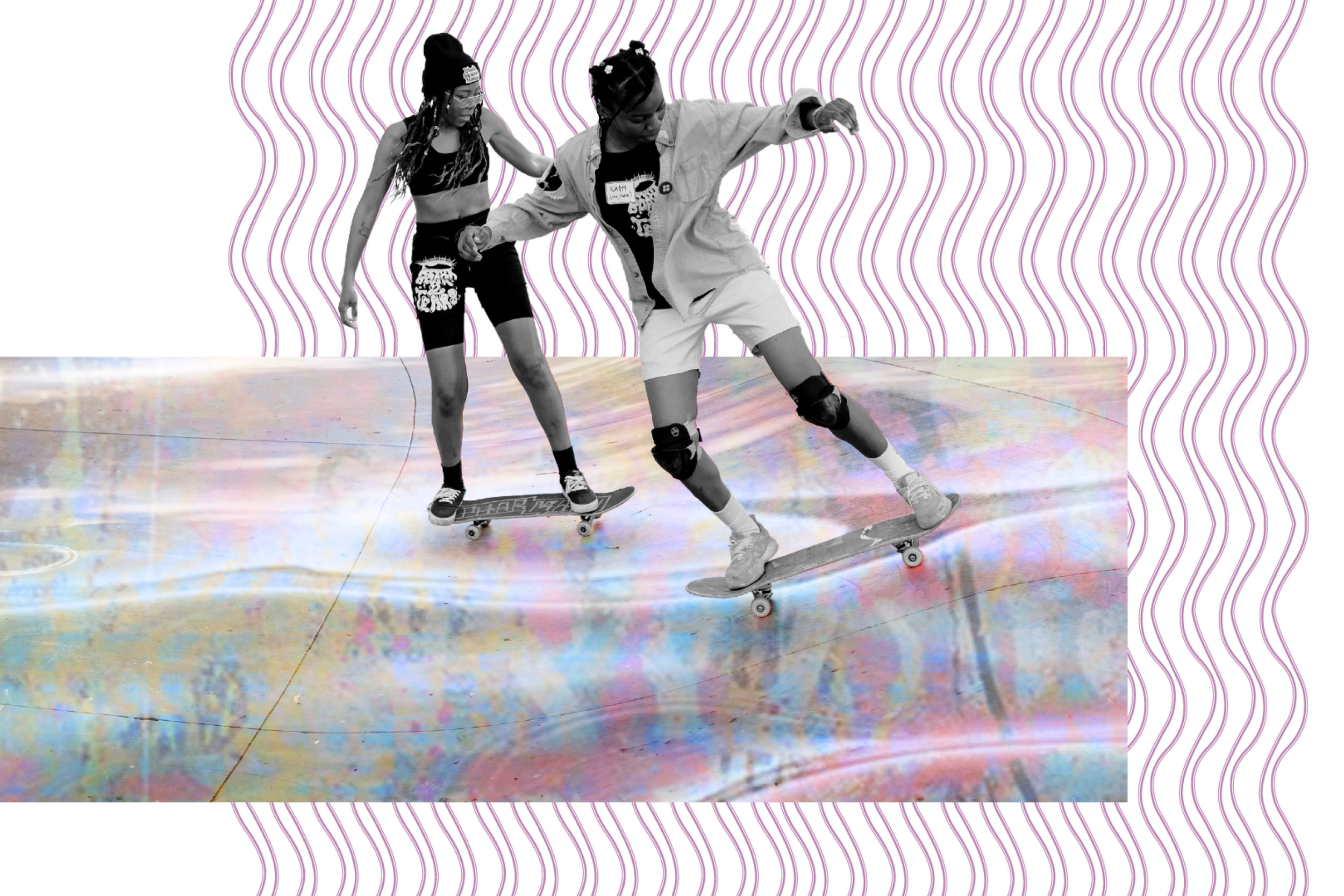
WE SKATE TOO
06.2022
Representation isn’t about checking a box. It’s about helping people see themselves and know they belong.
We Skate Too celebrates the voices, stories, and creative expression of women, trans, non-binary, and queer skaters whose contributions have too often been overlooked. This project reminded me that editorial design has the power to amplify communities—not by speaking for them, but by making space for them to be seen.
CLIENT
TRASH MAG
ROLE
Editorial Designer
TIMELINE
Three Weeks
RESPONSIBILITIES
Editorial layout
Publication Design
Art Direction
Visual storytelling
TEAM
TRASH MAG’S:
Founders
Editorial Team
Journalists
SCOPE
Editorial Concept
↓
Publication
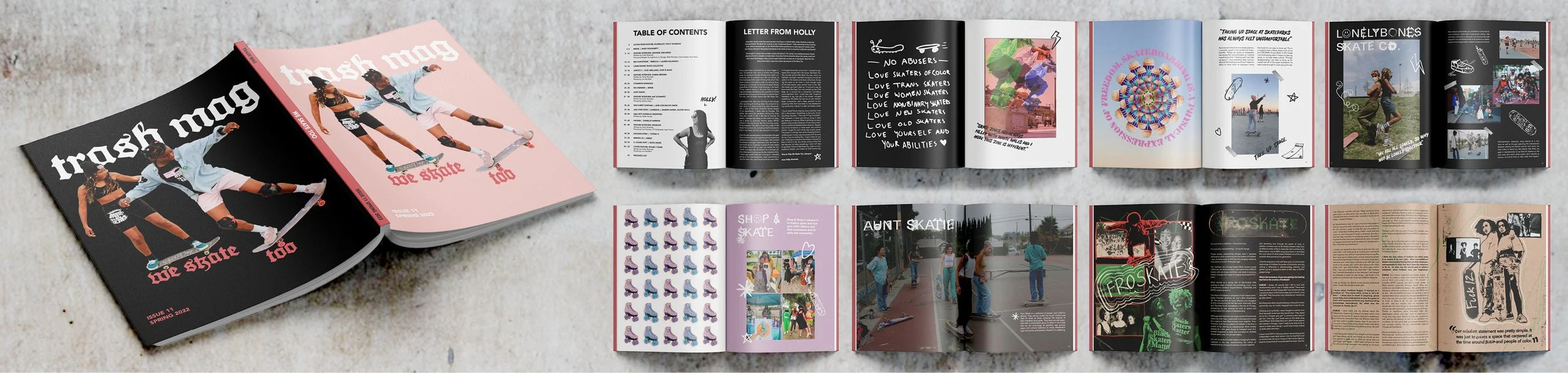
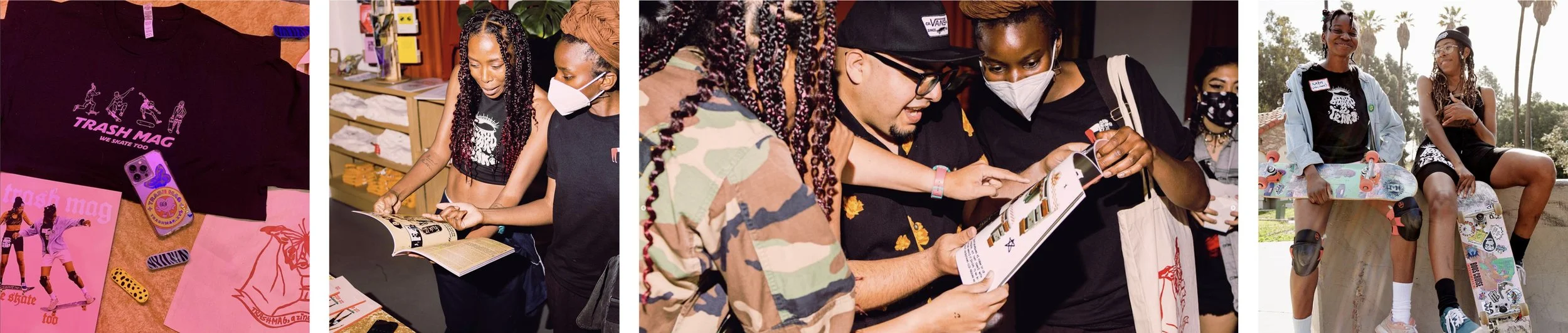
TRASH MAG is a multimedia publication founded to spark conversations around power, privilege, identity, and representation. Through print, events, and an international creative community, the magazine has become a platform for stories that often exist outside of mainstream narratives.
We Skate Too began as a series by journalist Holly Alvarado documenting the impact women, trans, non-binary, and queer-identifying individuals have had on skate culture. Those stories evolved into a printed zine that combined original reporting with submissions from skaters around the world.
I was invited to design three of the featured articles, translating each story into an editorial experience that celebrated the unique voice of every organization while maintaining a cohesive visual language throughout the publication.
CONTEXT
↑ LAYOUTS CONTRIBUTED BY OTHER DESIGNER
↓ 1ST FEATURE ARTICLE
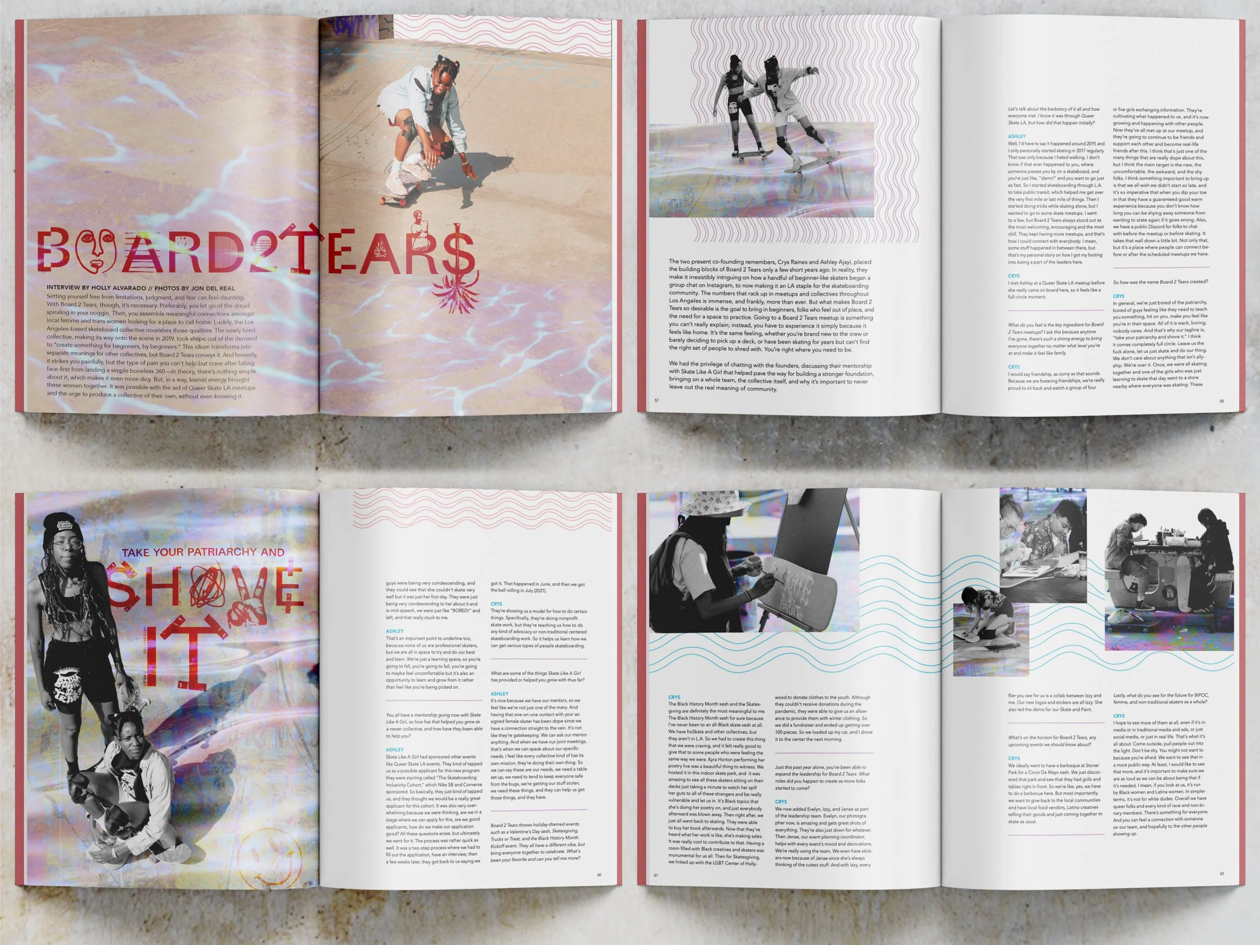
The challenge wasn't simply laying out a magazine. It was creating consistency without erasing individuality.
Each organization carried its own visual identity, energy, and community. Rather than forcing them into a single aesthetic, I developed a shared editorial framework that provided continuity while allowing every feature to express its own tone through imagery, typography, pacing, and composition.
The result was a publication that felt unified as a whole while honoring the distinct character of each story.
PROCESS
↓ 2ND FEATURE ARTICLE
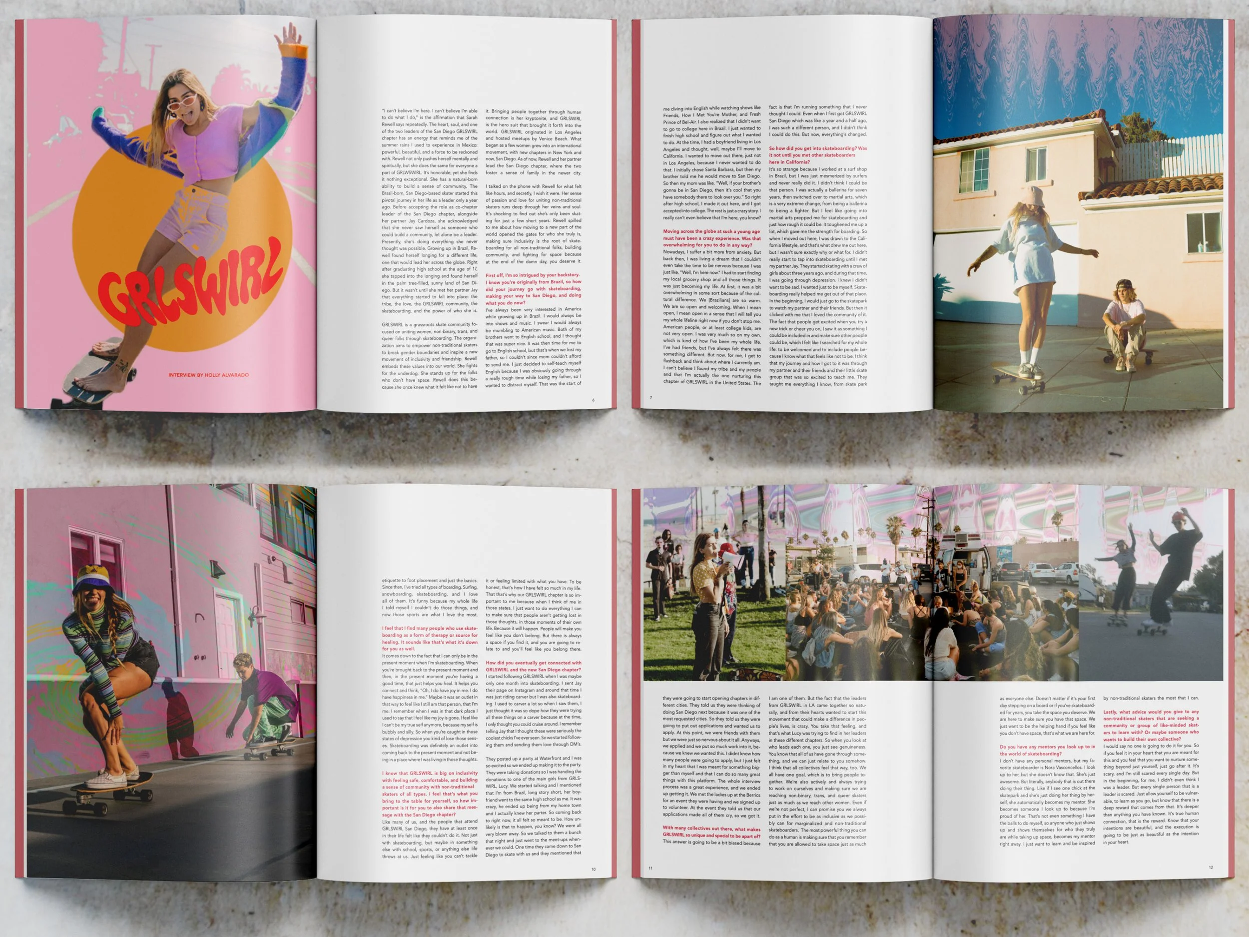
Editorial design became an extension of the publication's message.
Instead of treating each article as another spread, I approached them as individual voices within a larger conversation. Consistent typography established rhythm and readability, while custom layouts and imagery reflected the personality of each featured organization.
The visual system reinforced a simple idea: representation doesn't require uniformity. Communities become stronger when individuality is allowed to remain visible.
DESIGN DIRECTION
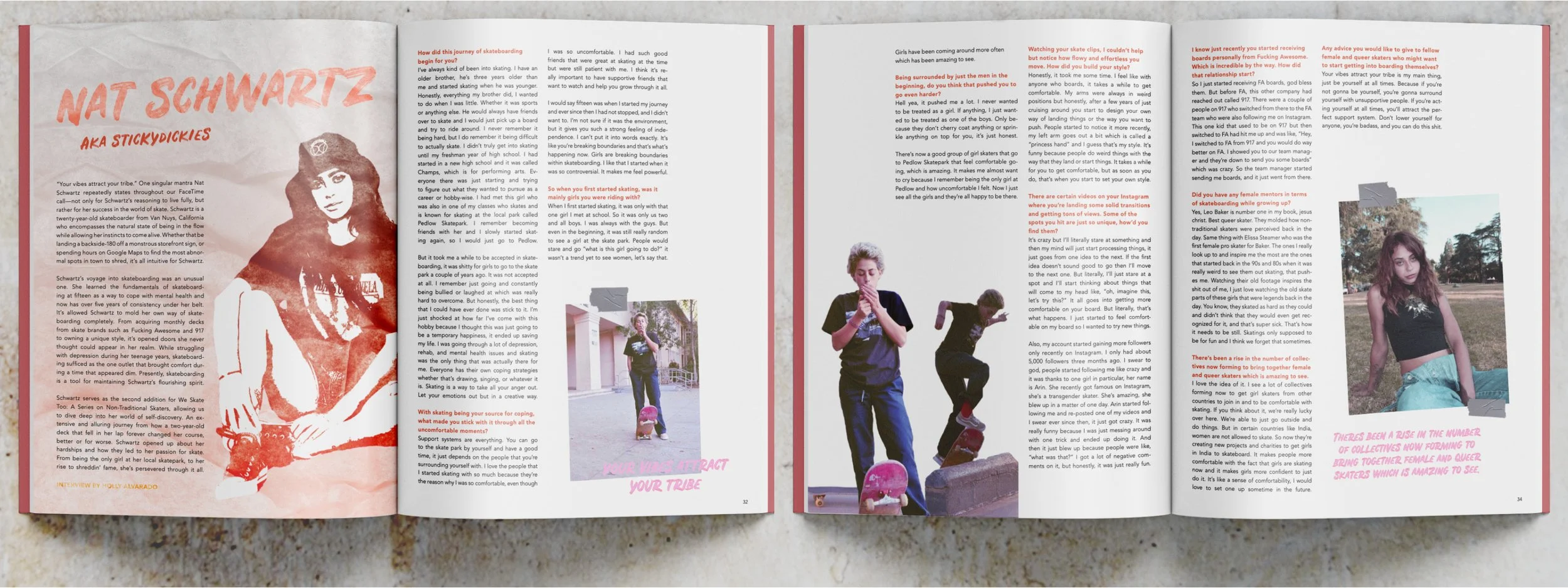
↓ 3RD FEATURE ARTICLE
We Skate Too became more than a publication—it became a celebration of a community that continues to reshape skate culture. By elevating voices that have historically been underrepresented, the project contributed to a broader conversation around visibility, inclusion, and creative expression.
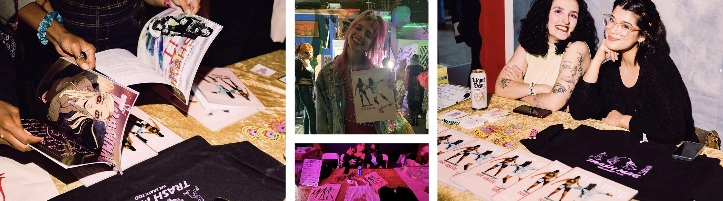
For me, the most meaningful moments came after the work was printed, watching readers recognize themselves and their communities within its pages. It reinforced the idea that thoughtful editorial design can do more than communicate information—it can create belonging.
IMPACT
This project reminded me that representation is about far more than visibility. It's about recognition.
The feeling of opening a publication and seeing your experiences reflected with care and intention.
That realization continues to shape how I approach design today. Whether developing brands, publications, or campaigns, I strive to create work that invites people in—not by speaking louder, but by making more room for different voices to exist together.
PERSONAL GROWTH
↑ ↓ IMAGES FROM COMMUNITY EVENTS